NYU CMEP 35th Brand Design
NYU CMEP 35th Brand Design
NYU CMEP 35th Brand Design
— ROLE
Lead Designer
— TYPE
Brand Design, Print Design, Production Design
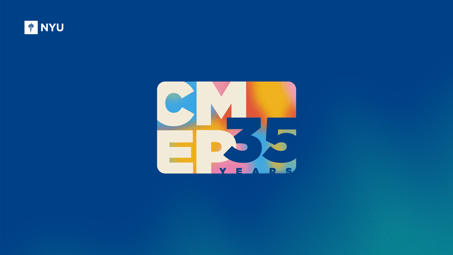
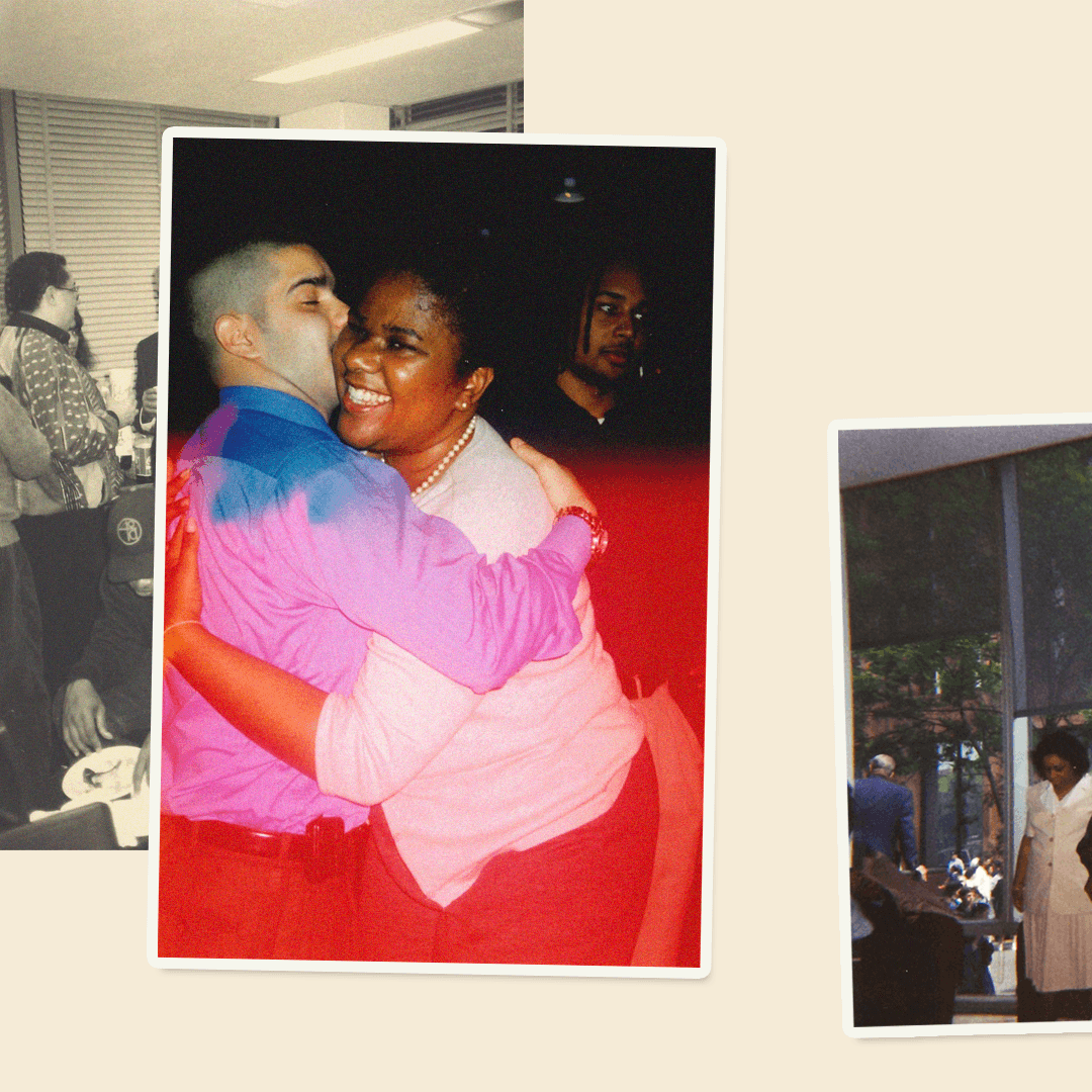
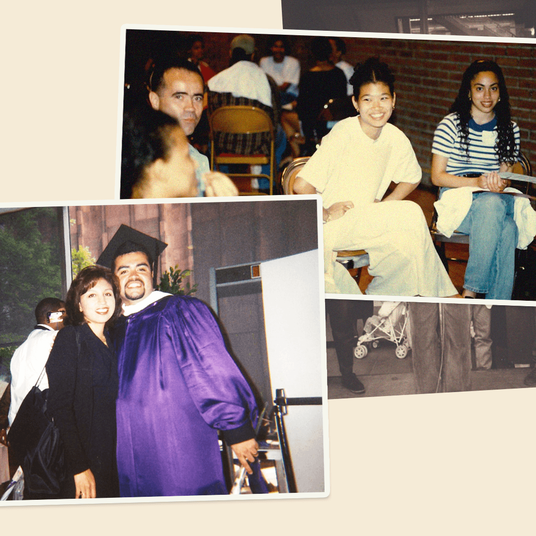
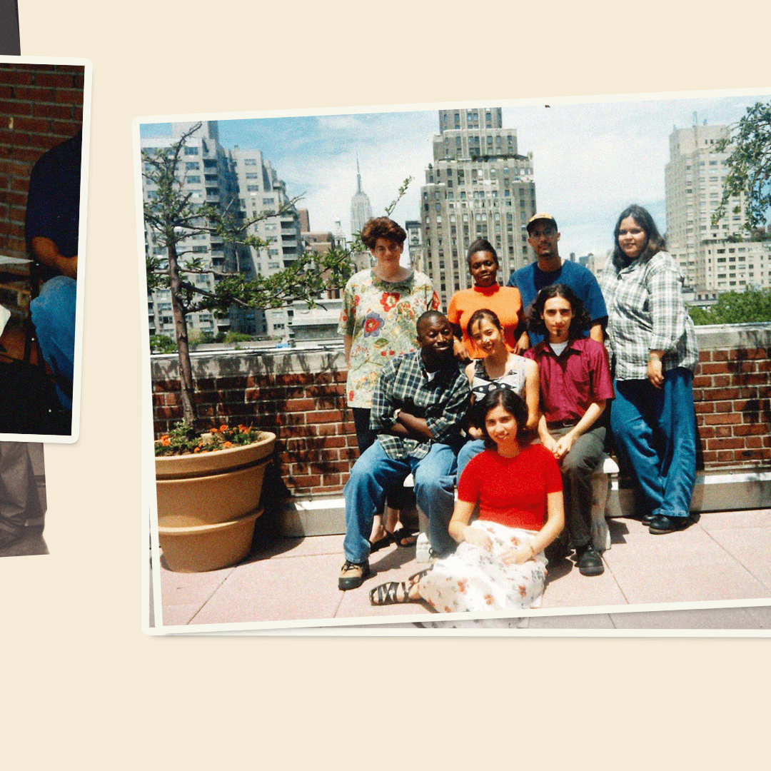
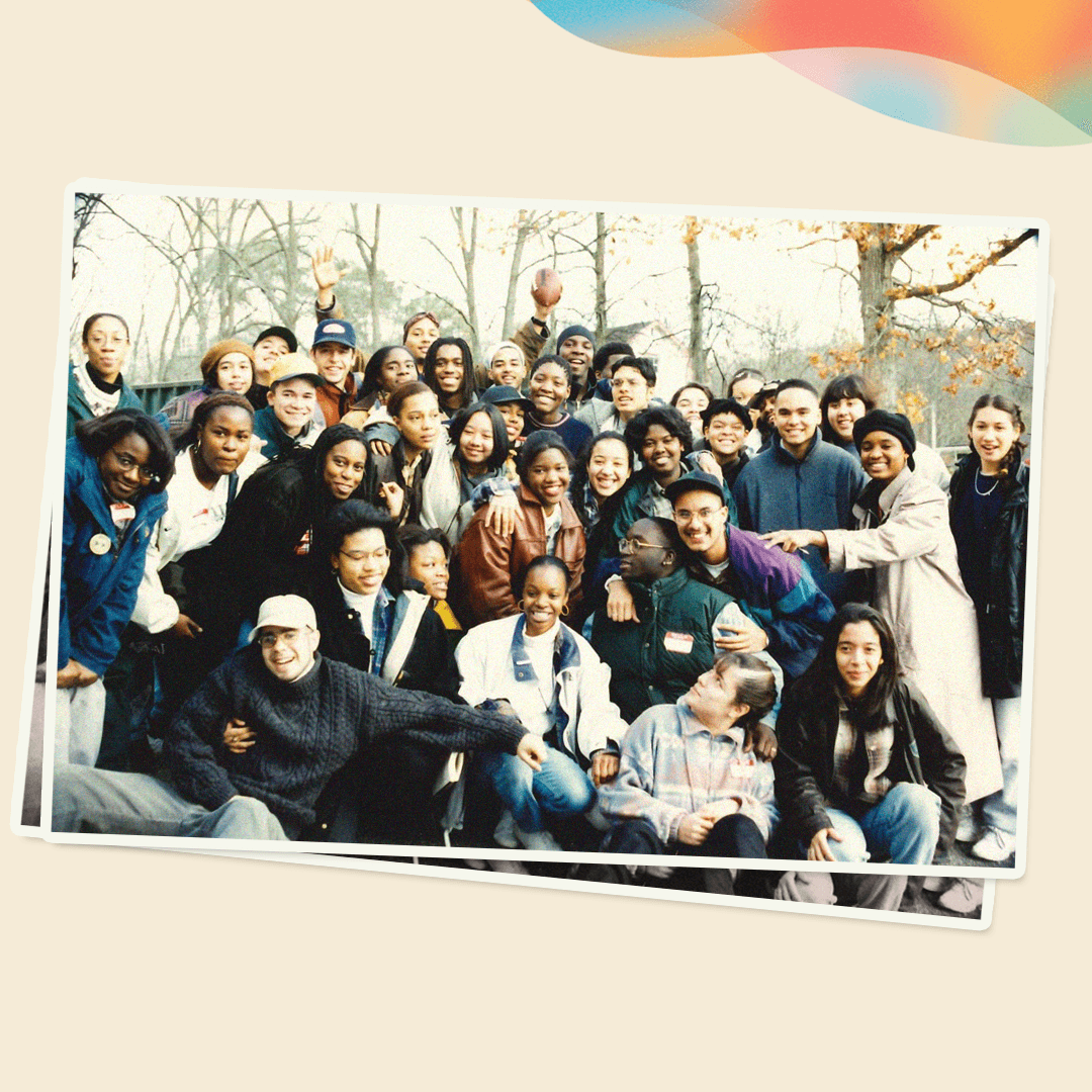
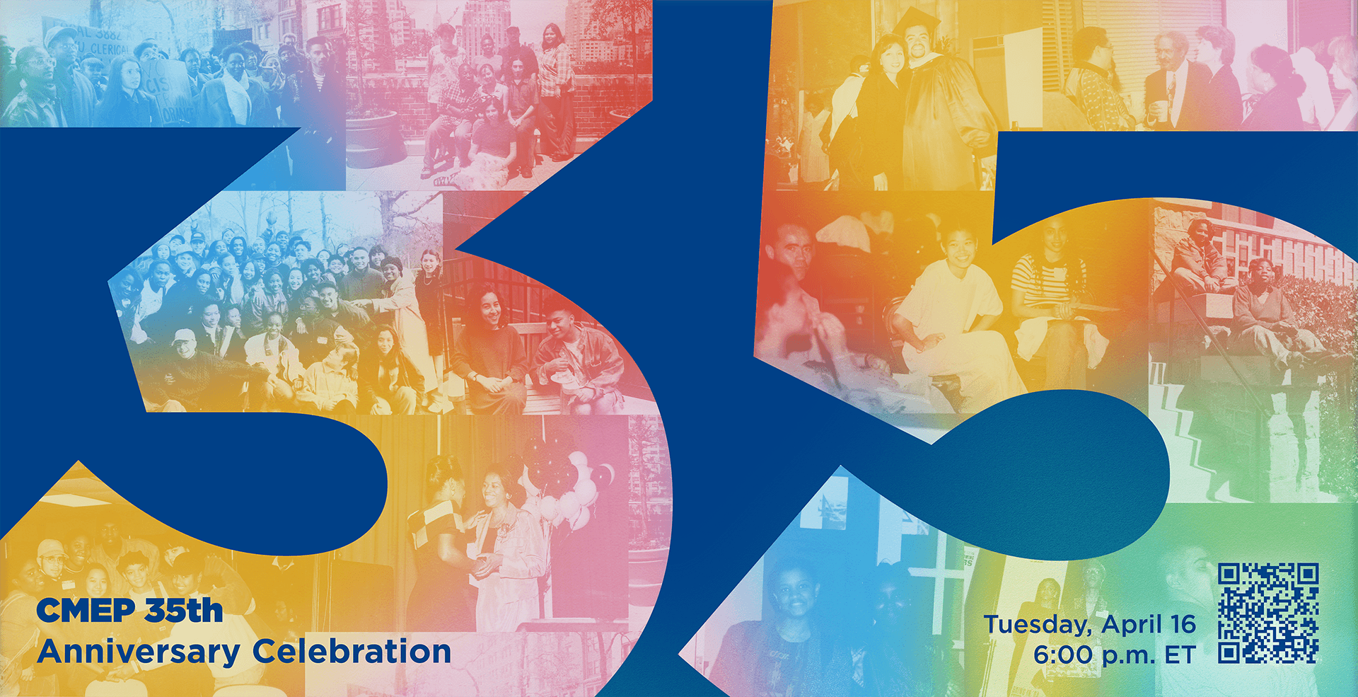
I led the design of a distinctive brand identity for NYU Center for Multicultural Education and Programs' 35th anniversary, from concept to execution. The brand integrates across digital, print, events, and merchandise, celebrating CMEP’s history while co-envisioning its future through a cohesive visual narrative.
Merchandise
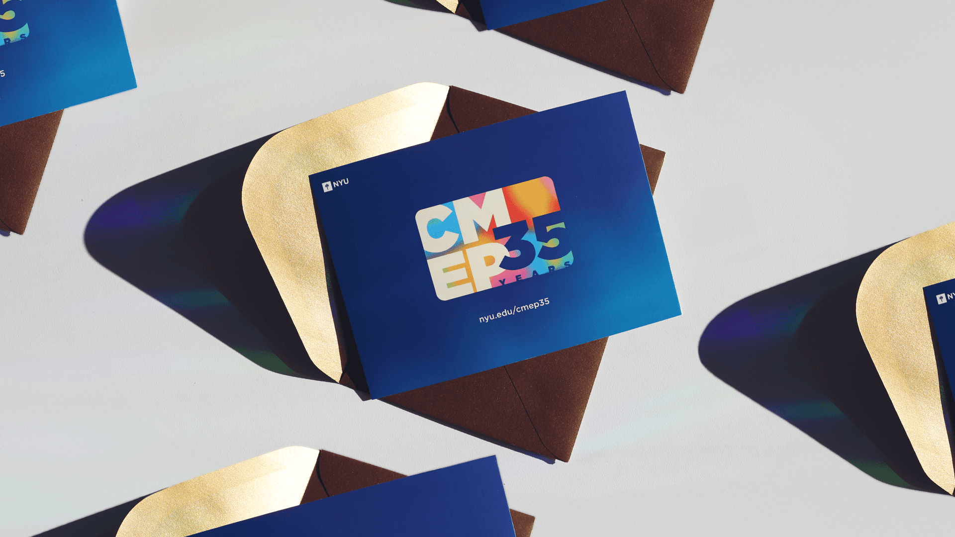
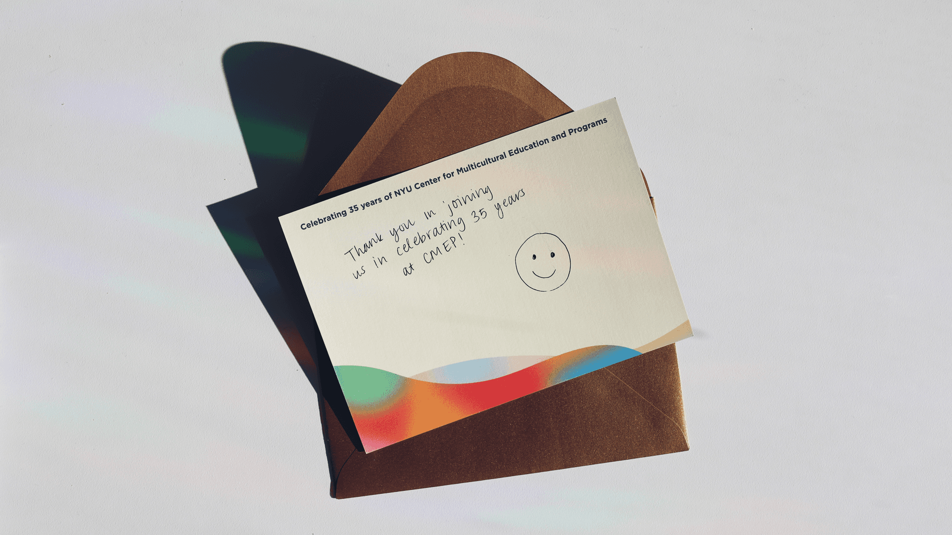
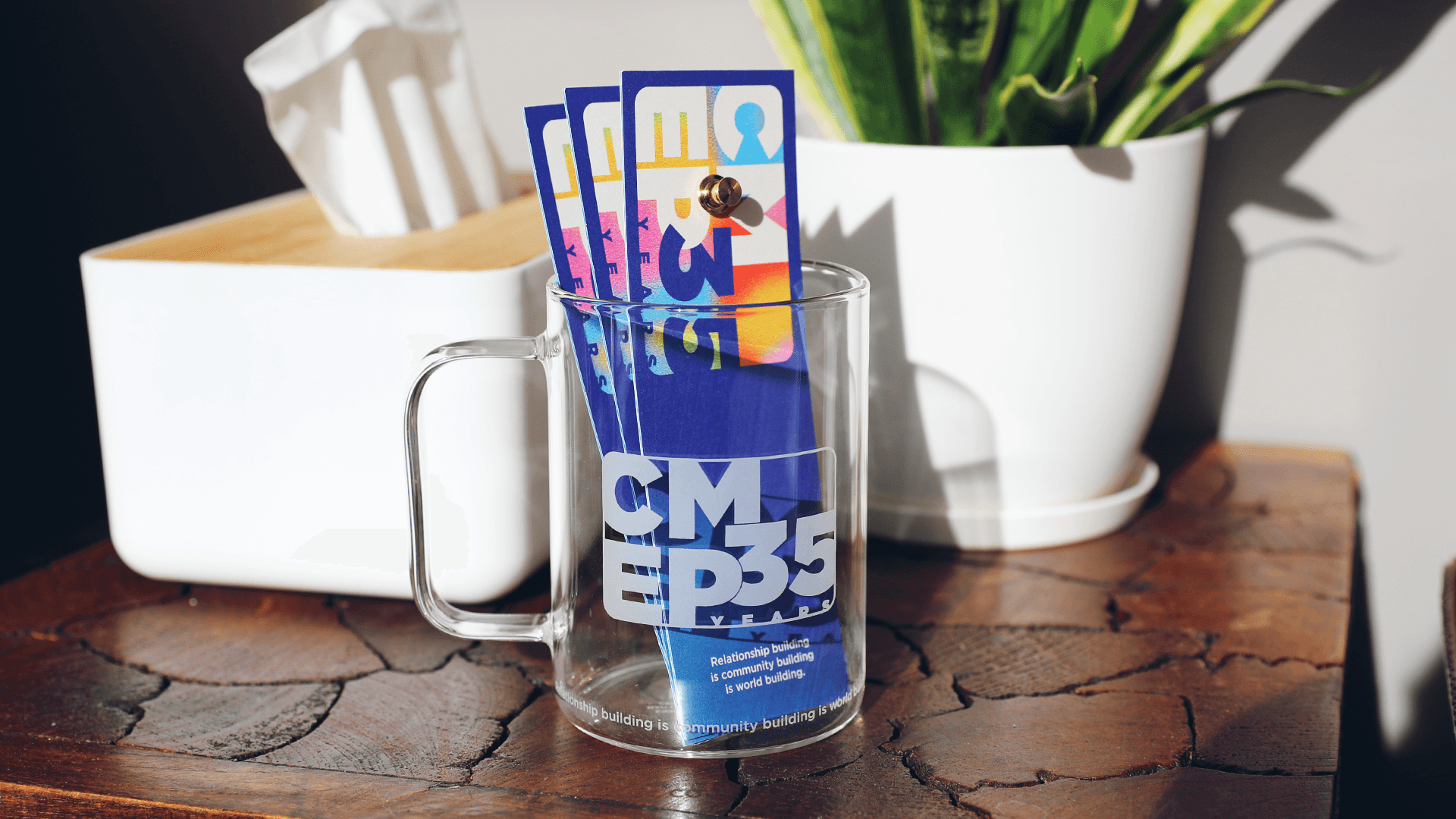
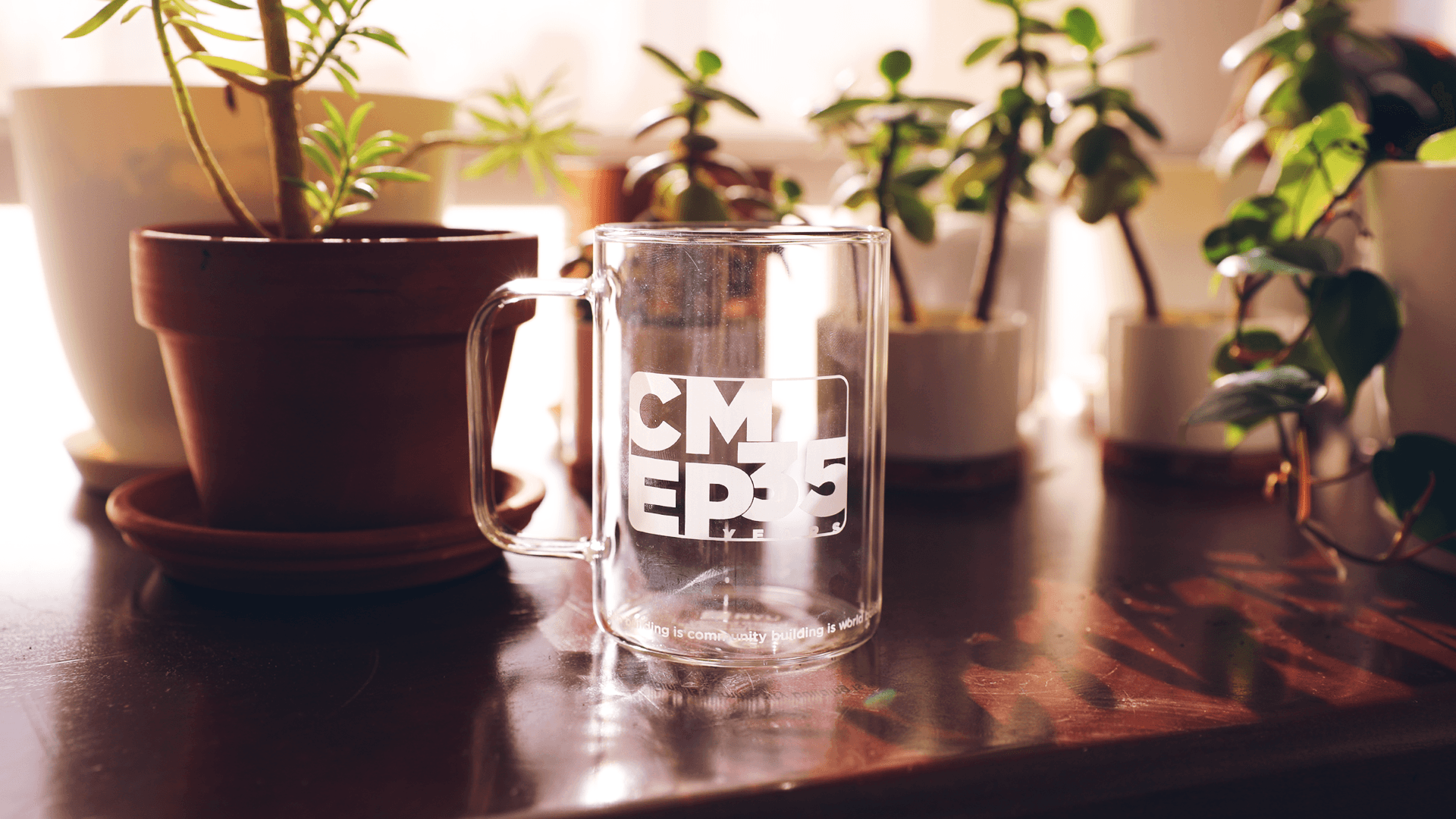
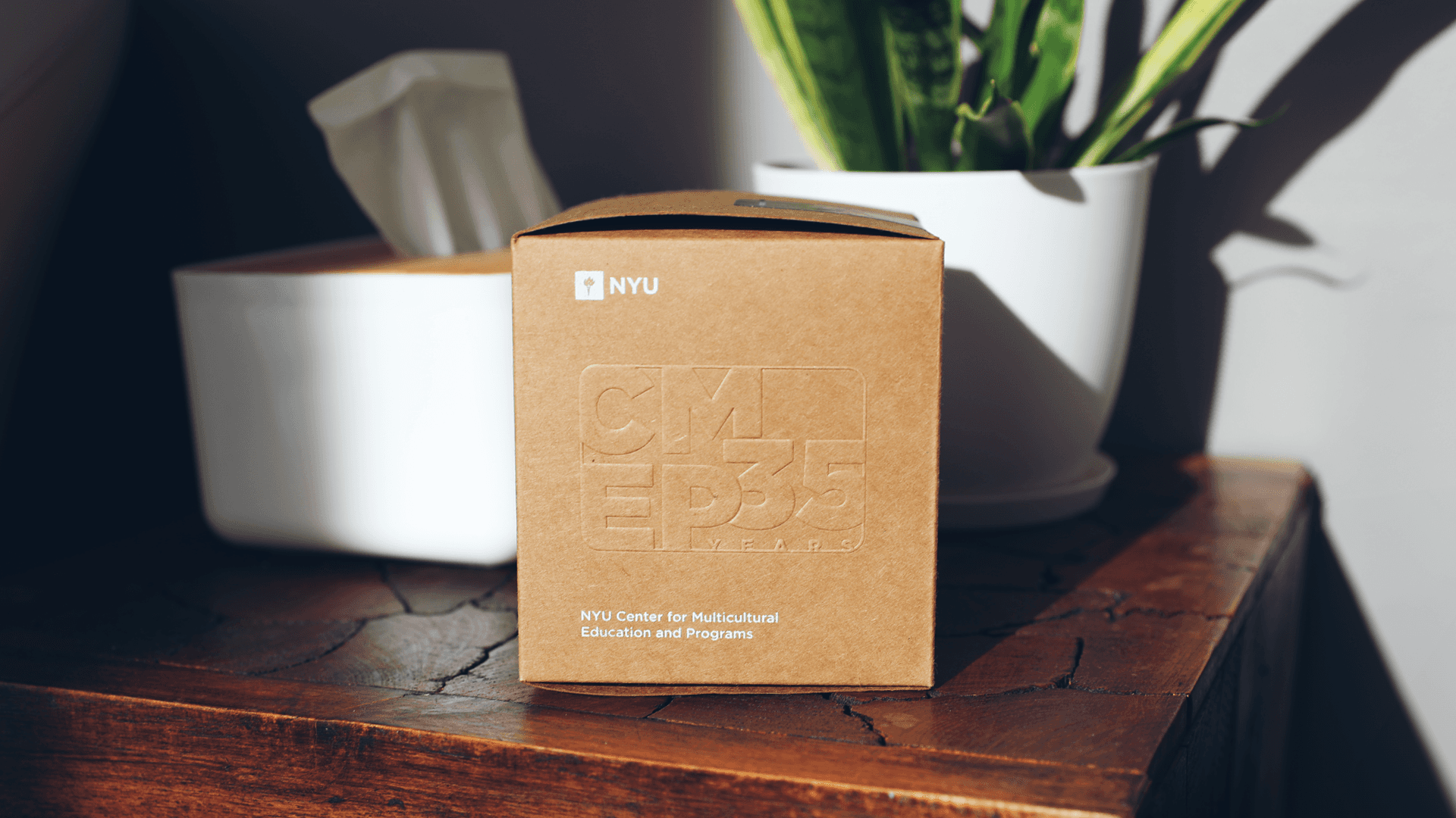
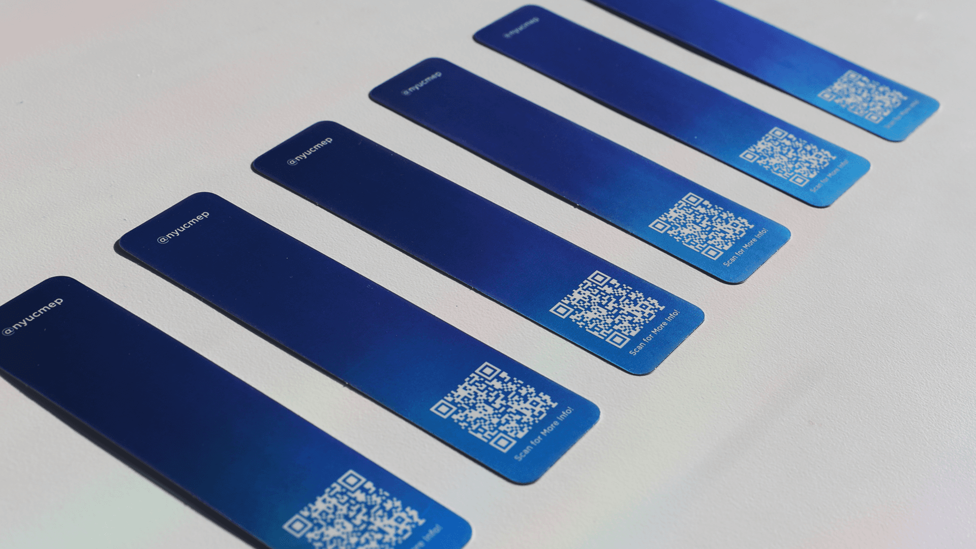
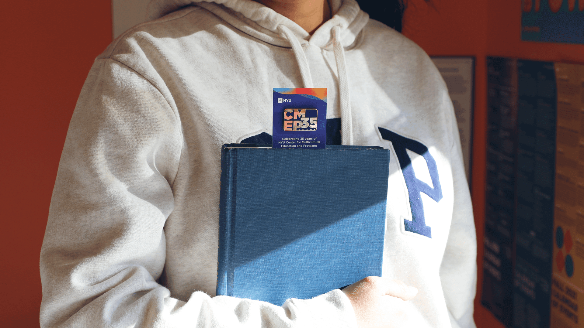
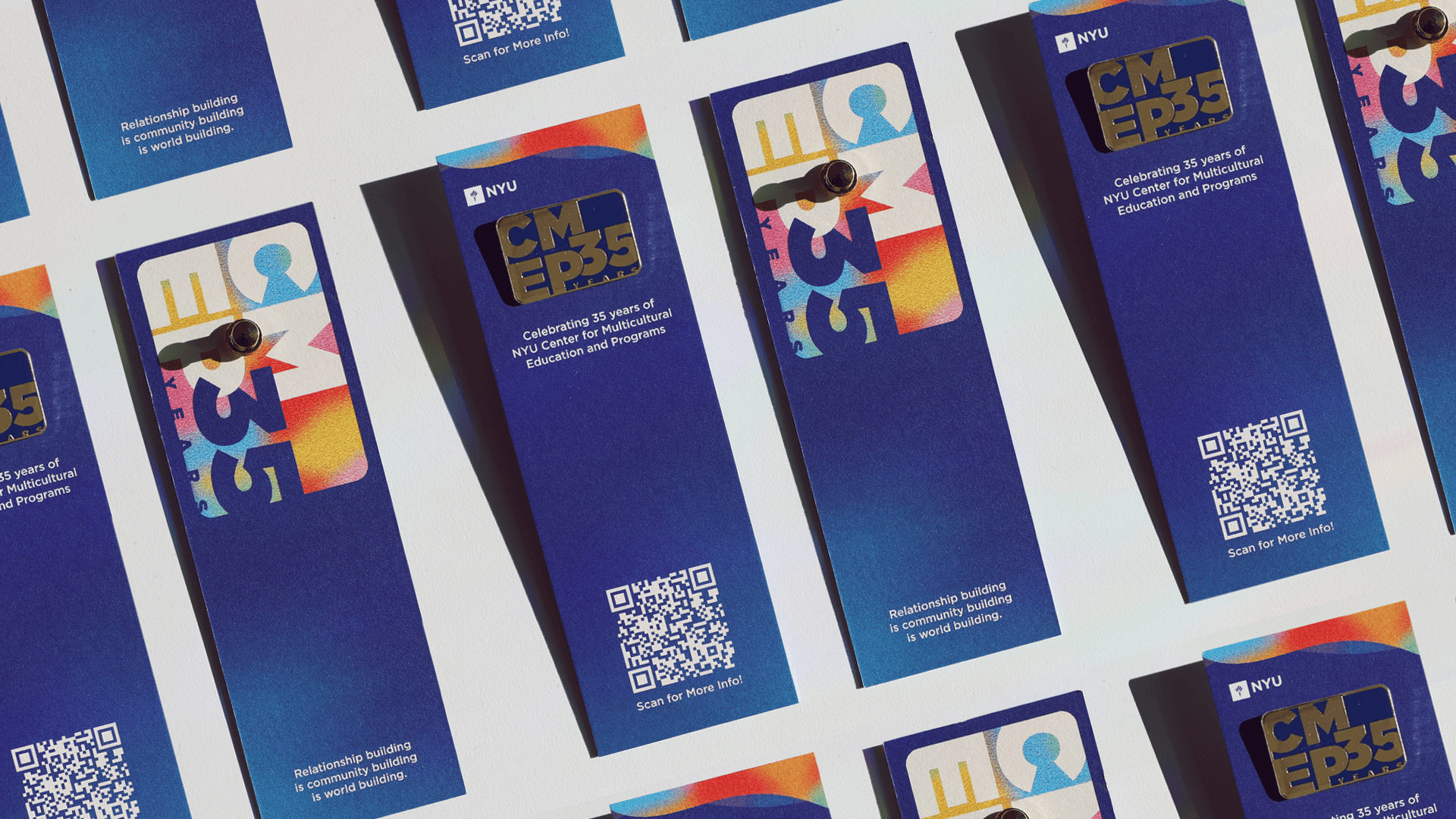
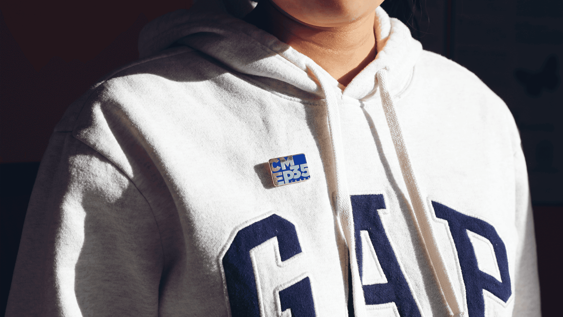
I designed an array of custom merchandise for distribution at CMEP 35th events, featuring enamel pins, bookmarks, etched glass mugs paired with custom packaging, and postcards.
Print and Merchandise
I designed an array of custom merchandise for distribution at CMEP 35th events, featuring enamel pins, bookmarks, etched glass mugs paired with custom packaging, and postcards.
Social Media/Digital Promotion
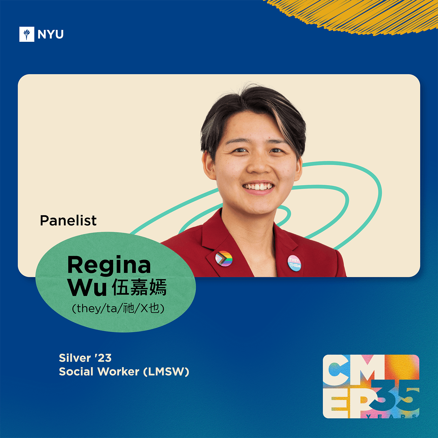
The branding was also used across various digital platforms, including social media channels and promotions on NYU CMEP’s online platforms.
Social Media and Digital Promotion
The branding was also used across various digital platforms, including social media channels and promotions on NYU CMEP’s online platforms.
Designed a digital brand identity for CMEP’s 35th Anniversary, celebrating its history while engaging the community to envision its future.
Creative Direction:
Visual Approach: Versatile color palette (avoiding neon), multi-colored yet subtle.
Tone & Style: Warm, inviting, and community-driven—elegant but approachable, unconventional yet distinctly CMEP.
Audience Focus: Resonates with current NYU community members.
The design balances tradition with a forward-thinking energy, embodying CMEP’s identity and values.
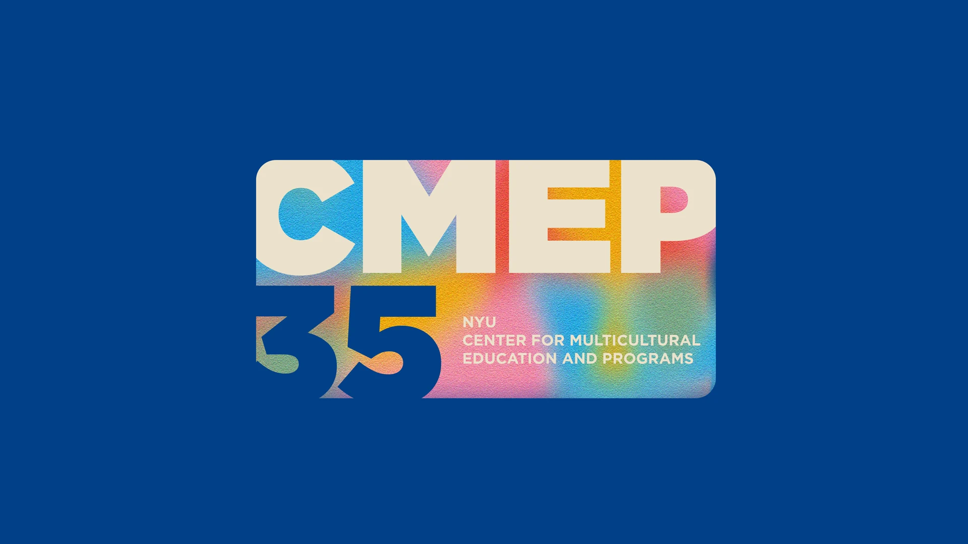
I initiated the logo design process by sketching preliminary drafts and utilizing the Gotham font—a crucial element of the established NYU CMEP brand identity. The overarching idea was to create a distinctive mark characterized by rounded edges and grouping, symbolizing the inclusive, welcoming, and communal essence of CMEP.
The use of warm, vibrant colors blending into each other, reminiscent of a celebratory gathering, helped create the multifaceted and inviting feel of the brand. After translating this colorful effect into a vector illustration, the focus shifted to selecting the final logo that would embody the brand’s spirit. Taking into account the team’s valuable feedback, I combined elements from two existing options to create the definitive logo for CMEP's 35th anniversary.
Logo
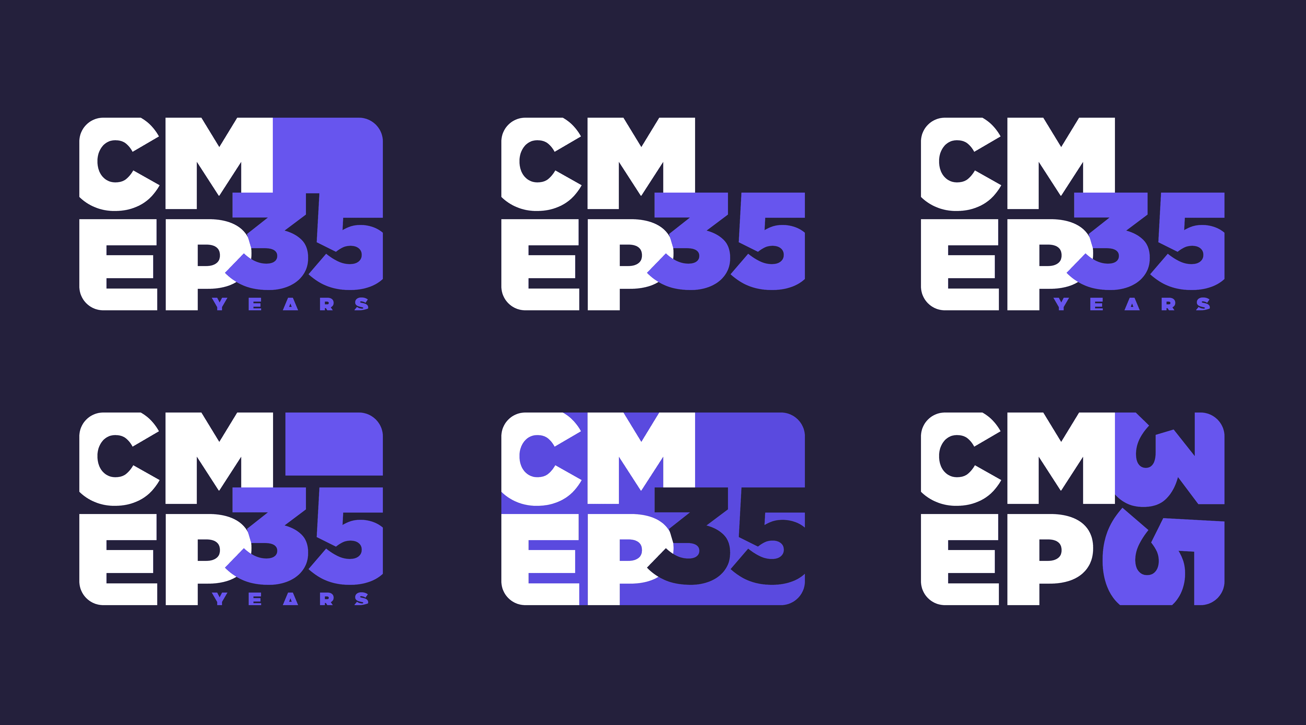
The CMEP 35 logo can be used in three different ways depending on the size and contrast requirements. All logos are always to be used against the solid dark blue or dark blue-to-teal gradient background, and should always be accompanied by the NYU Torch logo. The logo with CMEP’s full name can be used where there is more space/need for a bigger logo, and the smaller logo options can be placed in a corner when there’s less space for a logo.
Colors
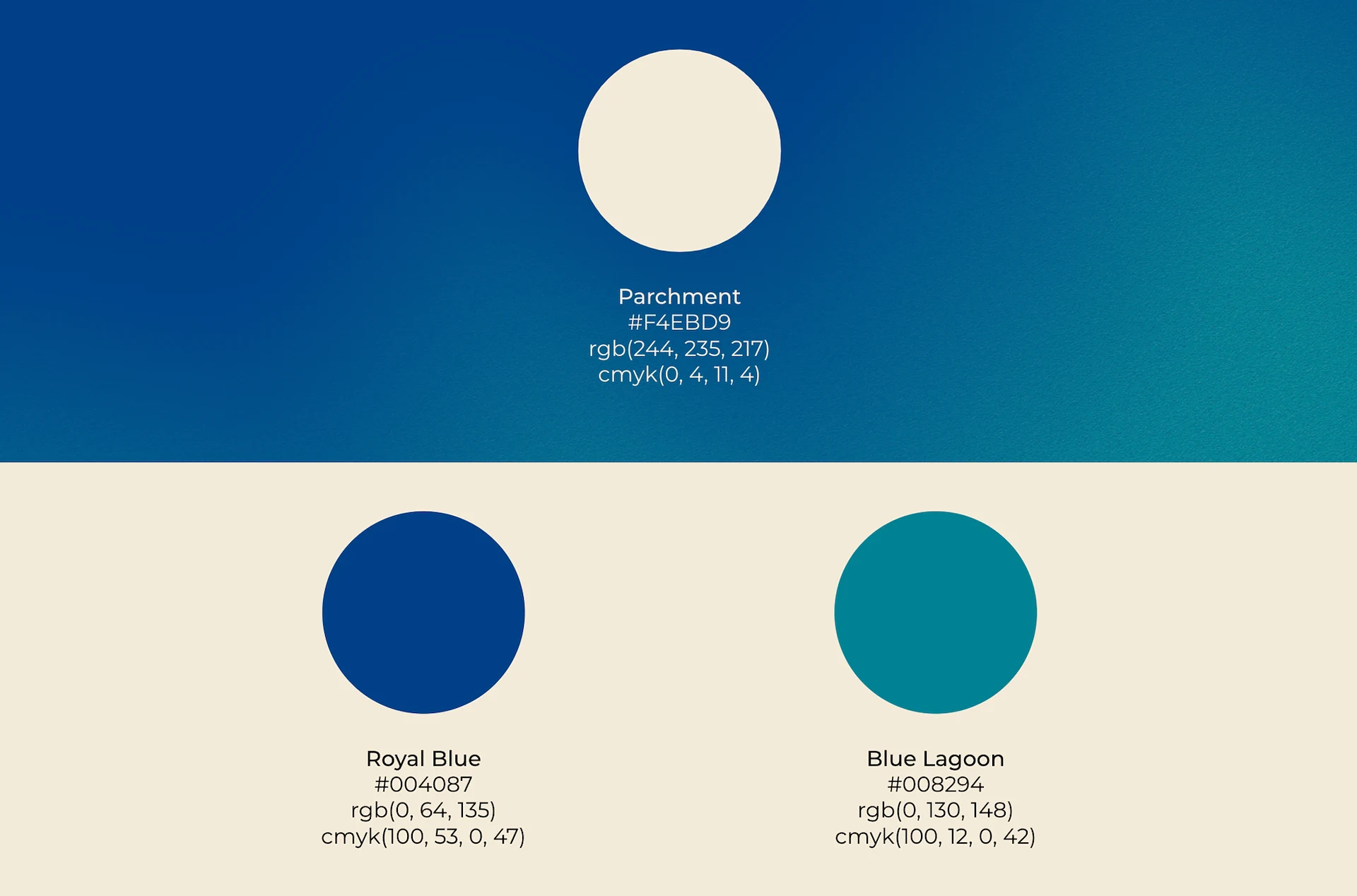
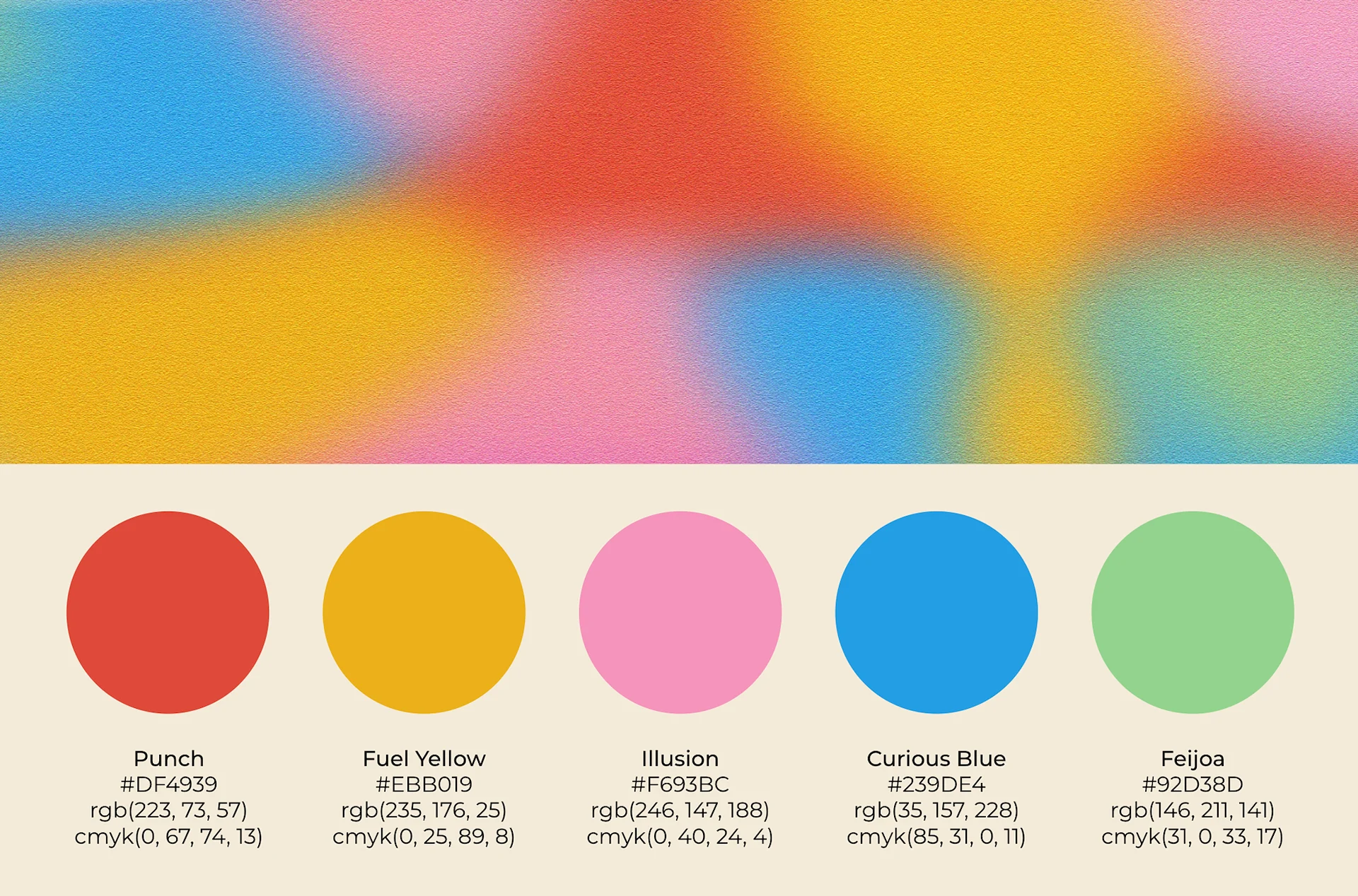
The main CMEP 35 colors are the off-white for text and contrasting elements against the blue-to-teal background. The multicolored gradient uses a combination of five colors: orange-red, mustard yellow, warm pink, light blue, and bright green.
Typography
The CMEP 35 YEARS text is always set in Gotham Ultra. Gotham should be used for all other text as well, ensuring CMEP 35 holds a connection with NYU branding in some way.
As one of my first large-scale university-wide brand design and visual identity projects, this experience taught me an enormous amount. From deeply understanding client needs to visually translating their stories and messages to managing the entire design and production lifecycle of physical merchandise—from concept through delivery—it was incredibly rewarding to receive enthusiastic feedback from colleagues and university partners. Many reached out to express their appreciation for the visual identity, and swag items like the enamel pins and mugs quickly became highly sought after.
If I were to do this project again, I would start vendor communications earlier and ensure design files remain flexible to accommodate last-minute changes. Overall, this was a gratifying six-month journey that strengthened my skills in brand building, project management, and cross-team collaboration.
